

- How Frictionless Customer Experience Dark Patterns Bypass User Judgment
- Why frictionless customer experience dark patterns work so well
- How manipulation actually works in these interfaces
- Who gets manipulated and why "sophisticated users can opt out" fails
- The case for targeted friction at high-stakes moments
- What ethical customer experience design actually requires
How Frictionless Customer Experience Dark Patterns Bypass User Judgment
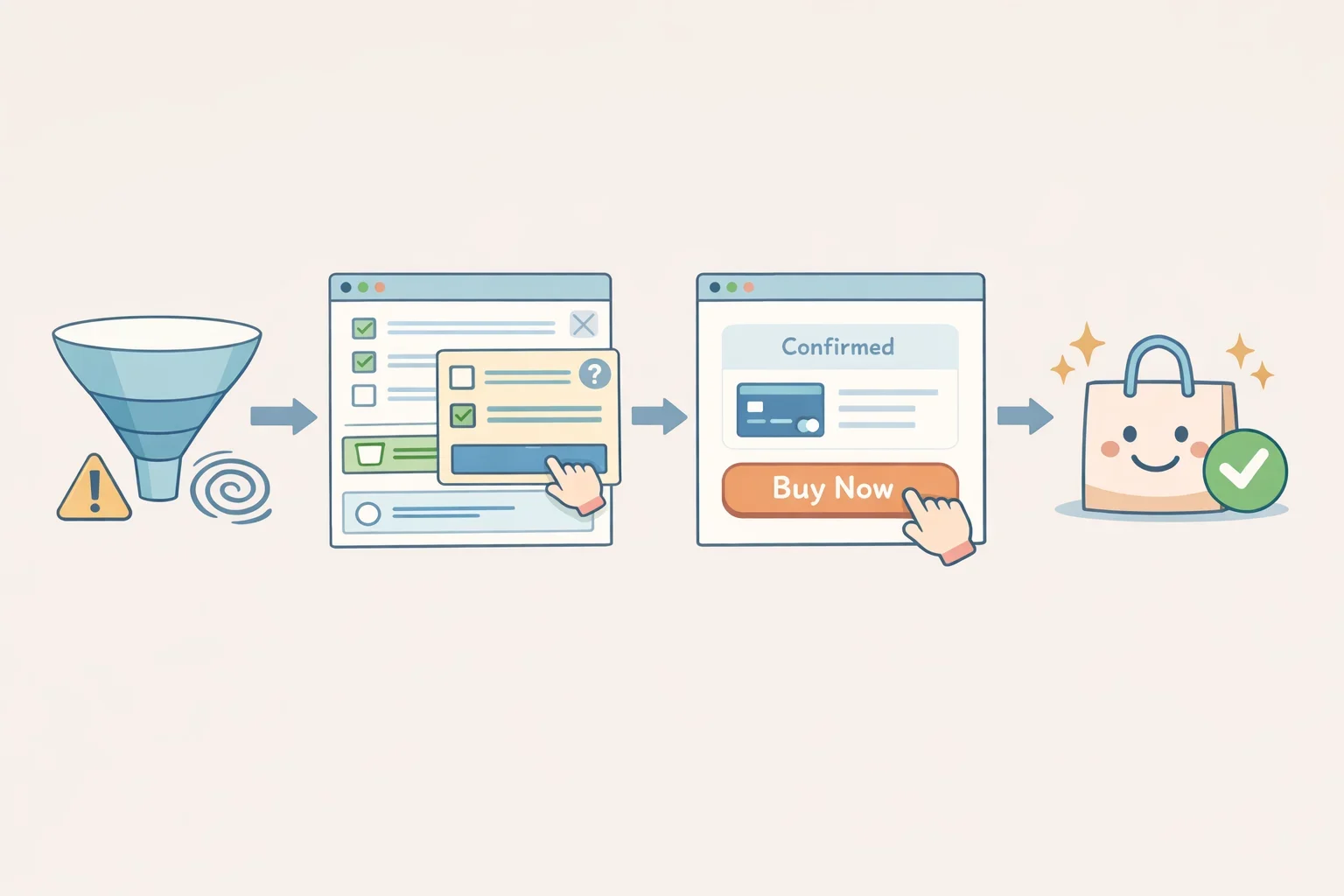
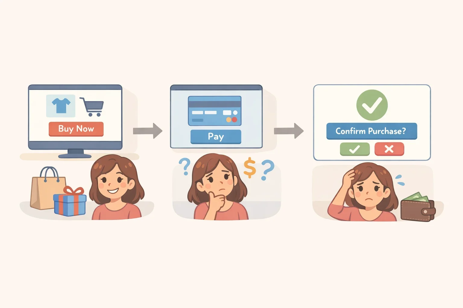
There is a moment in nearly every optimized checkout flow where a design decision gets made on your behalf. The card is already stored. The offer is flagged "Only 2 left!" A single tap commits you. Cancellation, if you want it, requires navigating three screens you haven't seen yet. The whole sequence takes four seconds. That is not an accident. That is a product specification, and it sits at the center of a growing body of evidence about what frictionless customer experience dark patterns actually do to the people they're designed for.
The argument here is narrow. Removing friction from digital interfaces is not inherently wrong. Eliminating redundant address fields, saving shipping preferences, reducing steps in a process users complete repeatedly that is genuine convenience. The problem is something more specific: frictionless design deployed to compress or eliminate deliberation at the exact moment a user is about to make a high-stakes commitment. At those moments, speed doesn't serve the user. It serves the platform.
Why frictionless customer experience dark patterns work so well
The scale of the problem makes the "bad actors" framing hard to sustain. Research cited in Cambridge University Press's Behavioural Public Policy found that roughly 97% of Europe's most popular websites and apps use practices that users recognize as dark patterns. This is not an edge problem affecting a fringe of poorly designed sites. It describes how the commercial web is built.
The Princeton-published crawl of approximately 53,000 product pages across 11,000 shopping websites makes the structural point more sharply: nearly 1,800 discrete dark pattern instances were identified, representing 15 distinct types across 7 broader categories, with 22 third-party vendors selling manipulative interface design as a ready-made commercial product (Princeton). These are not UX accidents. There is a market for them.
The Cambridge experiment, which randomly assigned 2,500 UK participants to dark-pattern conditions versus a neutral control, identified where that market does its best work. Dark patterns are most effective precisely when no further action is required from the user, and consumer vulnerability is highest in single-click, stored-payment environments (Cambridge). The smoother the path, the more completely judgment is bypassed. That is not a side effect. It is the mechanism.
How manipulation actually works in these interfaces
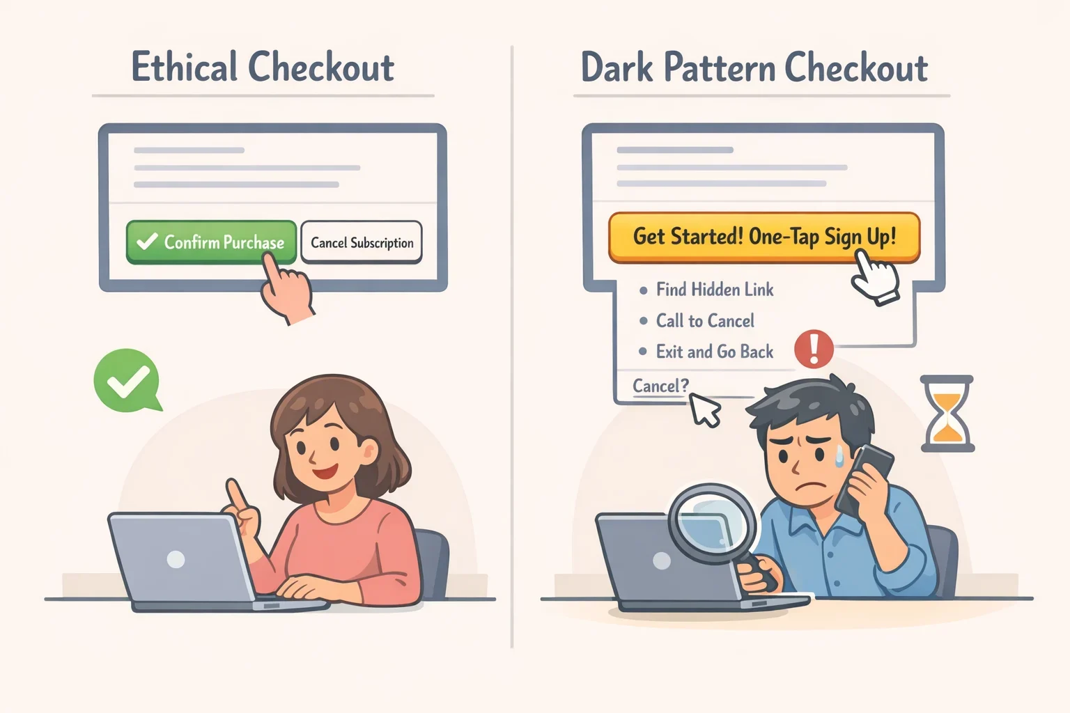
Dark patterns are interface designs that benefit a platform by steering or deceiving users into actions they did not intend, or would not endorse if they had a moment to reconsider (Princeton). The common forms are well documented: false scarcity claims ("Only 1 left!"), confirm shaming that frames the opt-out as a personal failure, roach motel designs that make cancellation far harder than sign-up, and trick questions engineered to produce an answer opposite to the user's intent (Cambridge). The toolkit is varied and deliberate.
The deeper mechanism involves three converging elements: opacity about what is actually happening, erosion of the user's sense of agency, and the resulting feeling of having been deceived (University of Vaasa). The design doesn't need to force anything. It makes one outcome feel obvious and the alternative feel like effort. The IEEE ISTAS paper "Consent by Delight" argues that positive affect flattery, excitement, social validation can suppress risk appraisal at the moment of disclosure, with the consequence that consent captured inside high-arousal, low-friction flows is ethically weak even when a formal notice technically exists somewhere in the product (IEEE ISTAS, "Consent by Delight"). Consumer AI features that collect biometric or behavioral data while users are absorbed in an entertaining or flattering experience are the clearest current example of this principle.
The distinction that matters is precise. A checkout that removes redundant steps is convenient. A checkout that stores payment details, surfaces a false urgency claim, and requires a single tap to commit with cancellation buried three screens deep is structurally different. The first removes unnecessary effort. The second removes the pause in which a genuine decision could occur.
Who gets manipulated and why "sophisticated users can opt out" fails
The standard industry defense is that informed, attentive users can recognize manipulation and override it. The susceptibility problem, on this view, belongs to edge-case demographics the elderly, the inexperienced, the distracted. Targeted warnings for vulnerable groups, not systemic reform, would suffice.
The Cambridge experiment dismantles this. Across 2,500 randomly assigned UK participants, susceptibility to dark patterns was largely uniform across income levels, educational attainment, and age groups. Prior research had expected demographic differences to emerge; they largely didn't (Cambridge). Because participants were randomly assigned rather than self-selected, this is causal evidence: the designs moved behavior across the board, regardless of who was on the other end.
Qualitative research using eye-tracking and retrospective interviews with 23 students at the University of Vaasa confirms that users do recognize the signals of manipulation unusual visual emphasis, suspicious urgency cues, misleading layout choices and respond emotionally, cognitively, and behaviorally (University of Vaasa). Given the small, homogeneous sample, this speaks to how users process manipulation rather than how universally they resist it. Recognition and resistance are not the same thing. The Cambridge data is unambiguous: when an interface is optimized for speed and positive affect, noticing is insufficient protection.
If susceptibility is effectively uniform across demographic groups, the personal-responsibility framing collapses. The problem is not that certain users need better media literacy. The market is designed to exploit everyone. That reframe has direct implications for marketers too. A conversion rate built on uniform susceptibility is not evidence of product-market fit it measures how effectively the interface bypassed deliberation. Those customers are the most likely to feel tricked afterward, and that is rarely a foundation for loyalty.
The case for targeted friction at high-stakes moments
Friction is not neutral. Introducing deliberation steps everywhere creates accessibility barriers for users with cognitive differences, imposes time costs that fall hardest on the people with least of it, and becomes paternalism at scale. The goal is not to reverse two decades of UX progress.
The evidence supports something more targeted than that. The Cambridge experiment introduced a separate payment step after participants had already been nudged by a dark pattern into accepting an offer. Many participants who accepted the offer did not proceed to complete the purchase once they reached the payment page (Cambridge). The pause was sufficient. Those conversions were not genuine preferences they were single-click compliance artifacts that evaporated when the user had one more moment to reconsider. At high-stakes decision points, a second step is not a UX failure. It is what separates a real decision from a captured one.
Platform-scale interventions point the same direction, even outside commerce. After WhatsApp added a restriction on how far "highly forwarded" messages could travel in a single action, that category of sharing dropped 70%. Twitter found that prompting users to read an article before resharing it increased reading behavior (Villanova Law Review). The contexts differ from e-commerce, but the principle is the same: small friction increases, placed at the right moment, changed behavior substantially without degrading the core experience.
Four moments warrant this kind of protection specifically. Financial commitment in single-click, stored-payment environments. Subscription enrollment with auto-renewal. Disclosure of sensitive or biometric data. Consent to data processing inside high-affect, low-deliberation flows. For exactly these contexts, the IEEE "Consent by Delight" paper proposes practical controls: just-in-time notices at the actual point of action rather than buried in onboarding flows, explicit opt-ins for sensitive processing categories, and comprehension checks before consequential consent (IEEE ISTAS). These are design choices available now, not regulatory requirements pending somewhere in the future.
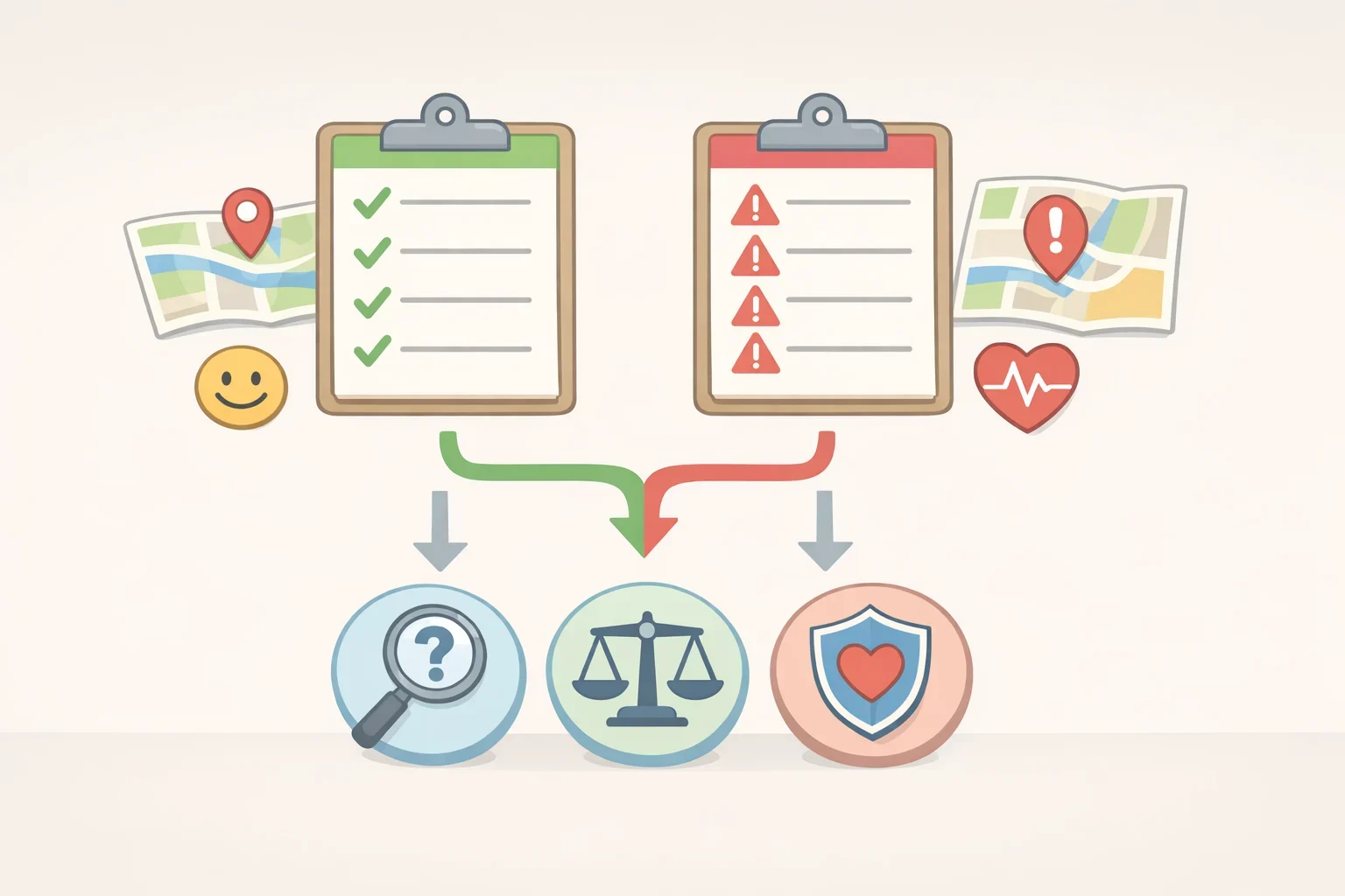
The diagnostic is straightforward. At any high-stakes decision point, three questions: Does this design obscure relevant information? Does it collapse acceptance and commitment into a single action? Does it make reversal harder than acceptance? A yes to any of these at a purchase, data-sharing, or subscription moment means the design is removing judgment, not removing inconvenience. The downstream costs cancellation resentment, regulatory exposure, loss of trust likely outweigh whatever conversion lift the dark pattern produced.
What ethical customer experience design actually requires
The frictionless ideal, applied across digital commerce and consumer technology, treats deliberation as a cost to engineer away. The evidence confirms that this works and that it works partly by suppressing the processes through which users would otherwise exercise genuine preference. That is the trap. Not convenience itself, but convenience designed specifically to eliminate the pause in which a user could have chosen differently.
Regulation is moving to address this regardless. The Cambridge paper notes that the EU's Digital Services Act takes a broad approach to dark patterns, operating on the premise that all users are susceptible rather than just specific vulnerable groups a position the study's own findings explicitly support (Cambridge). In the US, a Villanova Law Review analysis argues that friction-in-design regulation should be understood as content-neutral time, place, and manner restrictions analogous to rules on megaphones and march permits, which would face intermediate rather than strict scrutiny under the First Amendment (Villanova Law Review). That is a legal argument, not settled doctrine, but the policy direction on both sides of the Atlantic is pointing the same way. Companies waiting for regulation to set the standard are betting against the trend.
The practical standard is not complicated. Remove friction freely at low-stakes moments. At high-stakes moments financial commitments, sensitive data disclosure, subscription lock-in, biometric processing build in a deliberate pause. The three-question test above is the minimum threshold. A design that passes it is not slower or worse. It is one that produces a decision worth having made.
